This is your one-stop-shop for everything related to the Triller brand: logo files, color palettes, fonts, and more. Please review the best practices provided here anytime the Triller brand is used.
Logos
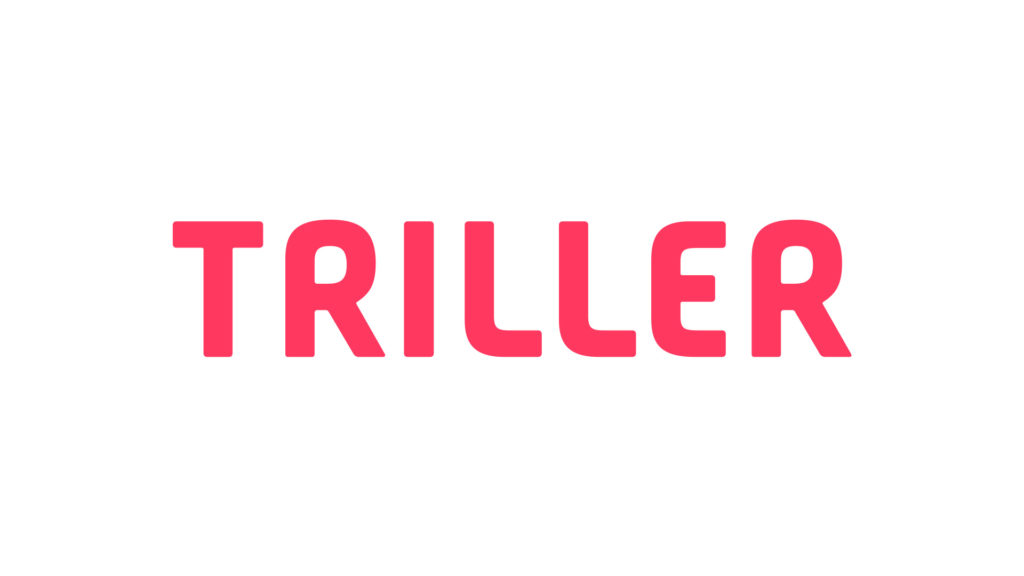
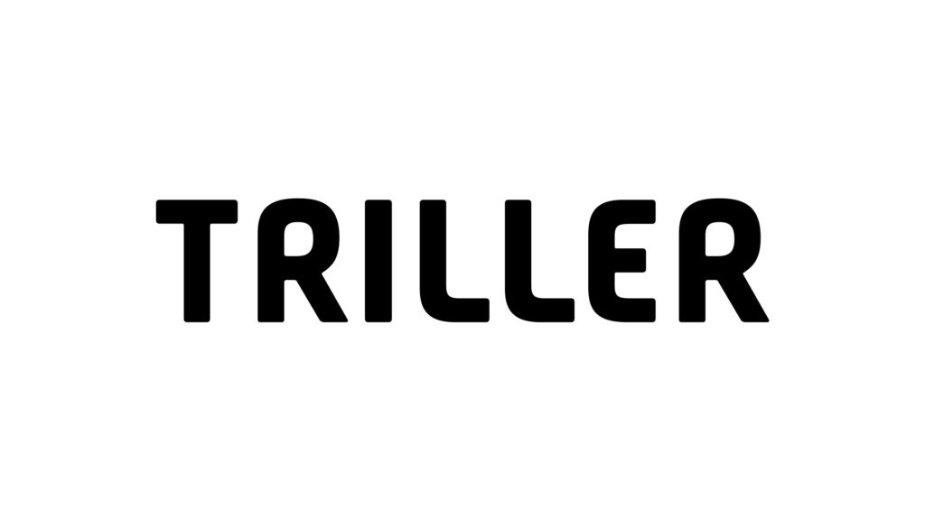
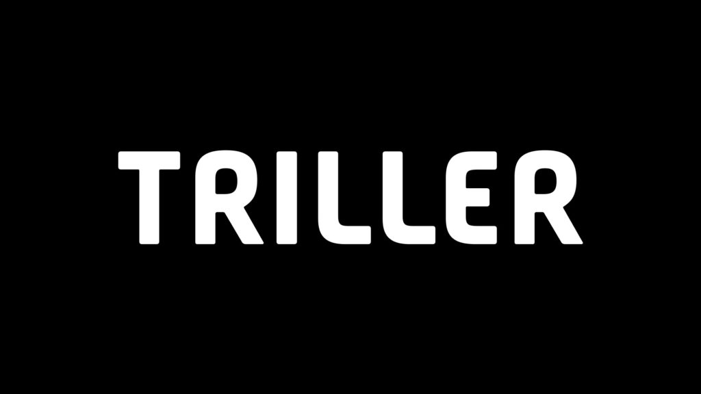
Triller’s Primary Logo is the combined wordmark + icon lockup in Triller Pink. The logo can also be used in black or white when necessary to maintain legibility.
The Triller Wordmark can be used as a secondary logo when the Triller Primary Logo would not be legible in application.
The Triller Icon can be used as a secondary mark, and is especially useful at small sizes where the Primary Logo becomes too hard to read (such as social media profile images). The Triller Icon can also be used as a supporting brand element when the primary brand has already been established.
Logo Usage
Do's
Use the Primary Logo in Triller Pink whenever possible
Make sure the logo is always legible
Only use the logo in Triller Pink, black, or white
Leave plenty of empty space around the logo
Dont's
Don't change the logo color (only pink, black, or white)
Triller Pink should be used as the primary accent color in all applications. Dark Grey should be used as the primary neutral/background color whenever possible. Electric Green should be used sparingly as a complimentary color to Triller Pink.
Triller Pink #FF3960
Dark Grey #1D1D1D
Electric Green #d4f387
Secondary Colors
Secondary colors should be used sparingly for things like small UI elements when additional contrast is needed.
Purple #6e45be
Blue #2378f6
Mint #a7fbed
Light Pink #ffc3cf
Yellow #fbe182
Peach #fcb48f
Neutrals
Neutrals can be used for backgrounds, text, UI elements, etc. Shade should be chosen based on maintaining legibility and contrast.
White #FFFFFF
Grey 1 #EFEFEF
Grey 2 #D8D8D8
Grey 3 #A4A4A4
Grey 4 #2A2A2A
Black #000000
Adobe Color Swatches
The button below will download an Adobe Library file. Importing this file into any Adobe design program will load the entire Triller color palette.
TT Commons Pro is Triller’s primary brand font. It is modern, clean, and easy to read. It can be used in Bold for headlines and shorter text, and Medium for longer body copy.
TT Commons Pro should always be used in sentence case.
TT Commons Pro Bold
Aa Bb Cc Dd Ee Ff Gg Hh Ii Jj Kk Ll Mm Nn Oo Pp Qq Rr Ss Tt Uu Vv Ww Xx Yy Zz 1 2 3 4 5 6 7 8 9 0 ! @ # $ % ^ & *
TT Commons Pro Medium
Aa Bb Cc Dd Ee Ff Gg Hh Ii Jj Kk Ll Mm Nn Oo Pp Qq Rr Ss Tt Uu Vv Ww Xx Yy Zz 1 2 3 4 5 6 7 8 9 0 ! @ # $ % ^ & *
Roboto Mono
Roboto Mono is Triller’s subheader font. It’s a monospaced font that can help add context to headlines. It should never be used for large bodies of text.
Roboto Mono should always be used at a small font size in all caps.
Roboto Mono Regular
A B C D E F G H I J K L M N O P Q R S T U V W X Y Z 1 2 3 4 5 6 7 8 9 0 ! @ # $ % ^ & *
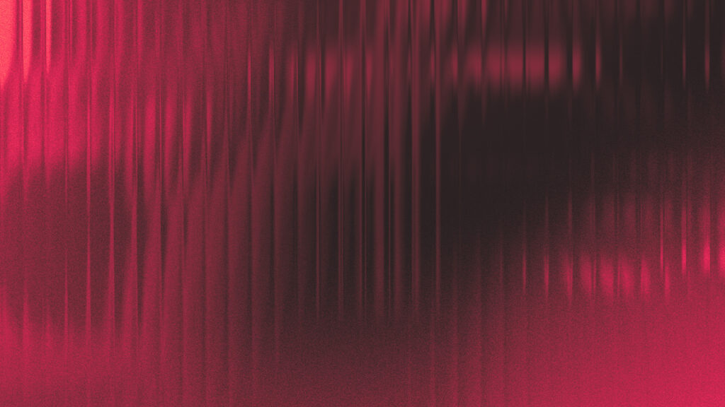
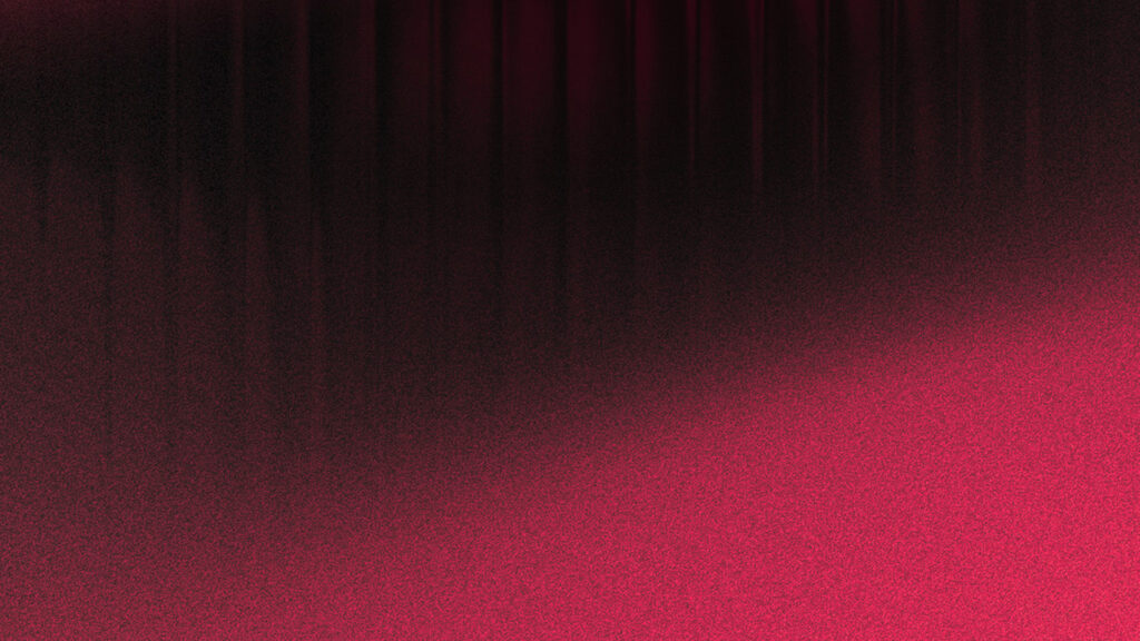
Triller uses a combination of grainy gradients and fluted glass to add color and texture to our marketing materials. Textures should never interfere with legibility and should always align with Triller’s brand colors.
Triller Texture Pack
The button below will download a .zip file containing several approved Triller brand gradients as well as a fluted glass generator that can be used to create custom textures.